Showing posts with label Research. Show all posts
Showing posts with label Research. Show all posts
Monday, 18 April 2016

Thursday, 14 April 2016
NME Magazine Advert Dimensions/Specification - Joshua Manley 9645
The link and image below illustrate the dimensions of the NME music magazine. This allows me to gain an understanding of the layout and dimensions needed to be able to publish my product and therefore I will conform the these measurements to make the adverts practical and realistic.

Monday, 29 February 2016
Focus Group - Rough Cut Audience Feedback - Joshua Manley 9645 and Kieran Panchal 9652
After producing a rough cut for our video, we decided to conduct a focus group. We figured that this would be a good opportunity to not only gain some feedback from our target audience, but also observe the reactions of an audience watching our product for the first time. We ensured to choose four participants who fit into the bracket of our target audience (we deduced this from observing the initial research questionnaires that we preliminarily carried out upon deciding upon the initial idea). Furthermore, we decided to show the audience our rough cut rather than waiting until the final product was complete, as this allowed us time to consider the feedback that we were given and then incorporate it it in our final cut if we felt necessary and appropriate. This proved to be a particularly worthwhile task as the feedback given was useful and the advice was almost entirely transferrable into our music video project. From carrying out this focus group the main points in terms of improving the piece are as follows:
- Additional stabilisation is needed
- A colour grade is needed
- The pace of editing should be adjusted in order to fit the song's tempo
- The drums should be more accurately synchronised to the soundtrack
- More careful consideration of diegetic sounds needed (helicopter)
- Improve shot decisions in order to ensure continuity throughout
- Further consideration of the transition between the narrative and performance scenes needed
- Consideration of the use of static shots next to shots that incorporate movement
We will try to amend each of these issues when improving our edit. In addition, we felt it was important to gauge some opinions regarding some positive aspects of our music video. This allowed us to consider whether we were on track to achieve what we desired, in particular, an immersive experience for the viewer. Our audience feedback so far suggests that we have achieved this.
Friday, 18 December 2015
Drone Usage Regulation - Kieran Panchal 9652
http://www.quadcopters.co.uk/caa-pfaw-guide-30-w.asp
When we film, we plan to use a Drone in order to shoot aerial images. By doing this, we will ensure to follow the guidelines provided by the Civil Aviation Authority, as follows.
"In order to make sure UAVs (Unmanned Aerial Vehicles) and manned aircraft are working in separate airspace, there are a number of limitations placed on UAV use. The rules below are subject to change by the CAA so it is worth noting that its best to check on there official website for upto date rules and regulations.
These are the main ones to keep in mind:
• The maximum altitude is 400 feet (120 metres)
• The maximum distance from the operator is 500 metres
• The minimum visibility needs to be 5 km
• UAV must be flown in line of sight of the operator
• UAVs cannot be flown at night without special permission
• Permission must be obtained from the owner of the take-off point
• UAVs cannot be flown within 50 metres of structures, vehicles or people that are not under the control of the person in charge of the aircraft. The rules are different for different weight classes unless a exemption is obtained.
It is perfectly acceptable to fly close to buildings and actors, for example, as long as permission has been obtained and the actors have been briefed about the use of the UAV. It would be highly irresponsible to fly over or near members of the public who are not aware of the purpose of the flight."
Furthermore, the drone has been registered by the owner and the permission of the actor has been obtained through the signing of the talent release document.
Sunday, 13 December 2015

Friday, 11 December 2015


Thursday, 10 December 2015
Further Location Scouting - Joshua Manley 9645 and Kieran Panchal
After carrying out extensive initial location scoutings, we decided to change our approach with the search. After contacting various location hire agencies around London, we found that logistically and financially many of these desirable locations were not viable. In response to this, we decided to alter the parameters of our search for our location, and we concluded that it would be more manageable and logical to search more locally, with the intention to find locations with lower costs. After another group meeting that involved thinking of ideas for locations locally, we carried out a location recce at the following locations.
The Gravel Works, Carthegena Fishery, EN10 2TA
Map Co-ordinates: 51.748811, -0.001140


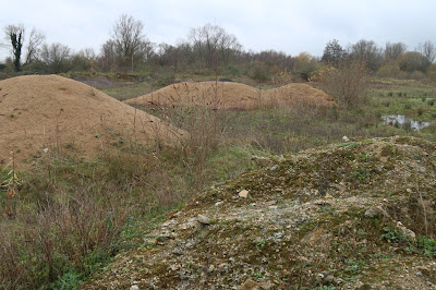


This location was formerly a sand and gravel works, an area where gravel was extracted when the surrounding gravel-pits (now fishing lakes) were originally dug around the 1950s (the image below shows the area when it was an active gravel extraction works). After receiving the go-ahead to visit the location, we carried out a location recce, which allowed us to extensively scout the area and subsequently gauge how suitable it would be as a setting for our music video.
From doing this, we found that the area had a very run-down, gritty feel to it, and there was a strong sense of abandonment, as it appears that the area has been left untouched since the withdrawal of the gravel extraction machinery many years ago. We felt that this suited the temporal and spacial context of our narrative, as it reinforced the post-apocalyptic theme. In addition to this, the location is logistically workable and as a setting, the abundance of space would give us great versatility and flexibility when making decisions on where to shoot, and with building small sets. This is private land so here, we are guaranteed to remain undisturbed by pedestrians and passers-by. We have successfully secured permission to use this location, free of charge, for as many days as necessary, making this more practical still as it will give us the opportunity to re-shoot/gain further footage if the need to do this should arise.
The images above were carefully crafted in order to provide us with the greatest view of as many aspects of the location possible that were relevant to our plot. We took these photographs as we felt that they would be particularly insightful and assisting in the storyboarding process. The photographs where we are included within the shot are also very useful as they allowed us to get a greater idea of the proportional size of the location.



The Gravel Works, Carthegena Fishery, EN10 2TA
Map Co-ordinates: 51.748811, -0.001140


This location was formerly a sand and gravel works, an area where gravel was extracted when the surrounding gravel-pits (now fishing lakes) were originally dug around the 1950s (the image below shows the area when it was an active gravel extraction works). After receiving the go-ahead to visit the location, we carried out a location recce, which allowed us to extensively scout the area and subsequently gauge how suitable it would be as a setting for our music video.
From doing this, we found that the area had a very run-down, gritty feel to it, and there was a strong sense of abandonment, as it appears that the area has been left untouched since the withdrawal of the gravel extraction machinery many years ago. We felt that this suited the temporal and spacial context of our narrative, as it reinforced the post-apocalyptic theme. In addition to this, the location is logistically workable and as a setting, the abundance of space would give us great versatility and flexibility when making decisions on where to shoot, and with building small sets. This is private land so here, we are guaranteed to remain undisturbed by pedestrians and passers-by. We have successfully secured permission to use this location, free of charge, for as many days as necessary, making this more practical still as it will give us the opportunity to re-shoot/gain further footage if the need to do this should arise.
The images above were carefully crafted in order to provide us with the greatest view of as many aspects of the location possible that were relevant to our plot. We took these photographs as we felt that they would be particularly insightful and assisting in the storyboarding process. The photographs where we are included within the shot are also very useful as they allowed us to get a greater idea of the proportional size of the location.

Epping Forest
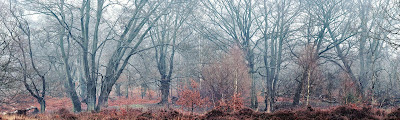
Epping Forest is an area of ancient woodland in south-east England, straddling the border between north-east London and Essex. It is a former royal forest, and is managed by the City of London Corporation. It contains areas of woodland, grassland, heath, rivers, bogs and ponds, and most of it is a Site of Special Scientific Interest.


Epping forest provides a lot of potential for our music video. The natural landscape can work very effectively for our product as in the winter it appear much more gritty and bleak which can relate to our narrative being placed in a post apocalyptic world. It has many avenues in which we could explore which could allow us to have a wide range of experimentation in regards to shots. In the winter the leafless tree would work very well in showing a run down deteriorated location. Also we came across many areas of the forest which were suitable to set up the set which would supply a very realistic scene. There were areas where remains of rivers where and also we came across piles of logs which would work very with the layout of our camp style set. However, we are aiming to create a small fire for our music video which would potentially put us and others at risk due to the forest environment. So this is factor we have to contemplate when deciding on a location. Also we discovered that to allow us to film at the location we would have to get a filming licence with City of London which could potentially take away a lot of our budget in which we would prefer to spend on other areas of our production.
Wednesday, 9 December 2015
Main Influences - Joshua Manley 9645
This music video created by Sia and Daniel Askill has inspired our product very much so in relation to costume, makeup and colour grading. We felt that despite the fact that this music video has been created for a different genre of music, the themes and concept can be applied to our own product. Here the makeup and costume are the main influences towards the overall mood of the video. By making the subject look very dirty, un-groomed, gritty and unhygienic the state of the subject can be depicted. Here the intention is to make him to weak and physically as well as mentally ill. This can be related to our product and we can apply the same technique in a similar way. Our character is placed in a post-apocalyptic world so everything will be bleak, dirty and deteriorated. By making our character look filthy through the use of makeup, scruffy beard and hair and dirty costume it will allow us to create and indicate a specific perspective on the character in relation to his deteriorated health and state. This will therefore contribute to the overall bleakness of our product which will be furthered through the colour scheme/grading which we use. We feel that the little contrast and dull greys used in Elastic Heart would also work very effectively with our post-apocalyptic theme. The colours in our product are ver important as they indicate the context and content of the film, We will aim to make the visuals appear very cold and desaturated whilst experimenting with contrast levels.
The final scene in Whiplash, a 2014 film directed by Damian Chazelle, provided us with great inspiration for our product, despite it being of a different genre to our product. Not only did this influence the decisions that we made in the planning of our narrative, but also those made when planning shot types, mise-en-scene and cinematography. In terms of the plot, we were particularly enticed by the passion and intensity of the music in the piece, and this was something that we were eager to replicate in our own product. In terms of cinematography and editing, we were significantly inspired by the way that short sequences have been created in the most intense parts of the scene using quick-paced editing techniques with cut transitions, increasing the vigour and passion. In particular, Extreme Close Up shots have been utilised to great effect, outlining his facial expressions and the details of the drum kit. We could use this to a similar effect, to show the drummer's passion whilst also showing the worn condition of the drum kit.
The music video for Holocene was another large inspiration for us in terms of the miss-en-scene, and in particular the locations where it was shot. Throughout the piece, there is a continual theme of natural landscapes, which form a very organic and raw aesthetic. We were keen to emulate this in our own product to some extent, however, we plan to modify this convention in order for it to be more fitting with our narrative. Whilst we embrace the idea of using large landscapes in our piece, the picturesque and idyllic feel of them will contrast, as we plan to create a post-apocalyptic and desolate setting rather than an attractive, scenic and vibrant one. The use of long shots and extreme long shots which allow us to contextualise the physical size of the location in proportion to the subject are also an effective element of this piece, which will transfer well into our own product.
Tuesday, 1 December 2015


Monday, 30 November 2015
Primary Research for poster Ancillary task - Joshua Manley 9645
After creating my mock up designs for my ancillary task of a poster I decided to gain primary research which allowed me to have an insight into the opinions of our target audience. The main motif of this research is to gain an understanding to what our audiences preferences. This provides us with qualitative which allows us see the perspective and opinion of our target audience. Qualitative data is typically descriptive dataand as such is harder to analyze than quantitative data. Qualitative research is useful for studies at the individual level, and to find out, in depth, the ways in which people think or feel.
Feedback:
Ellie Burrell Bicker/Female/18 Years Old- The fourth one is the most relevant to your music video. The drums being the focal point on this poster will correspond with the close ups and attention to detail that you will be filming in the actual music video, as I know that drums play a very important role in your media product. The shadows and dark blue tones are effective in the photograph, and the text being featured at the top and bottom of the frame works well, rather than having text in the middle of the frame interrupting the composition of the image.
James Bell/Male/40 Years Old
I like the 2nd one as it is counter stereotypical that an old man should be associated with a rock band, the misenscene of the smoke evokes a spirit of relaxation and rebellion as does the pose. I like the low key appearance of the shot.The next preferred image is the 4th one, option three is ruled out as it is a cliche, band members looking as if they are not interested in the camera and relaxed amongst each other.
Danielle Fletcher/Female/17 Years Old
The first poster design is very successful, and in particular portrays the artist and the cryptic style of music that they create. The simplicity adds to the bands image, and works well in attracting audiences to the poster as it does not overload the audience with information or large images of the band members. Despite this simplicity the important information, such as the bands website and the album name, is included and conveyed to the audience. The only criticism of the poster is that the ABC Records logo could be moved to the bottom left of the poster in order to make it more visually pleasing to the audience. However, this is a minor detail and I think that overall the poster is very successful at attracting the correct target audience and also informing the audience of the important information.
George Ring/Male/17 Years Old
When looking at these four advert designs, my favourite by far is the first one. The reason I like this, is due to the simplistic nature of the poster. The blue colour used is bold, yet it also has a rustic feel about it due to the grains in the colour. I like the contrast between this and the text, which is white and stands out among the background. It also feels much cleaner and more professional compared to the other posters here. If I had to choose a least favourite, it would be the second one. This is because I feel like it doesn't stand out as the image of the male is much stronger and therefore takes away the artist. I also do not like the positioning of the text in the second design.
Beth Pannifer/Female/17 Years Old
Beth Pannifer/Female/17 Years Old
I feel that the most successful mock up poster design is the first one because I feel that the simplistic approach is very effective in presenting the information both clearly and effectively. The text stands out clearly from the background and the use of the bands logo is very effective as it would instantly attract the audience. The texture of the background provides a retro feel to the poster which can relate very effectively to the genre of the band. As a suggestion you could use a different colour as the background which has a certain connotation which is relevant to your project or which could compliment the music video. Also you could include a review on the poster or even one of the most successful songs in the album (your chosen song) to provide the audience with a further insight to the product and therefore intriguing them more.
Conclusion from feedback
The feedback above clearly shows that the preference of the respondents was the first mock up poster due to its simplicity and retro feel which is relevant to the genre of music which the band works in. Also I will take into account the points of improvement suggested by the respondents as their opinions are extremely relevant as they lay in the target audience of my product. I also got feedback from James who is considered to be out of our target audience categorisation but it was also interesting to gain his opinion.
Monday, 23 November 2015
Location Scouting - Joshua Manley 9645 and Kieran Panchal 9652
Location 1:


Locations 2&3


After contacting the owners of these two locations and requesting the possible hire, I learned that it would be very difficult to hire a location similar to the ones above due to their specifications and size, therefore making them very expensive and ultimately out of our budget.
Drive Two, Bethnal Green, E1
Shootfactory.co.uk


This warehouse suited the theme of our narrative as it was large enough to allow us to create a sense of space and atmosphere in the setting. In addition, the industrial nature of the location and run-down feel also would be ideal for creating the context and establishing the genre around the narrative. We also contacted several agencies that provided a hiring service for this location but unfortunately this location was over budget and therefore had to be ruled out.
Grange Barn, Coggeshall
nationaltrust.org.uk/grange-barn


The Grange Barn in Coggeshall would have also been a suitable location for our shoot, as the barn would have created an effective rural aesthetic. We figured that because this was a national trust site, the hiring of this space may be discounted or easily accessible. After getting in contact with the site to ask about availability of the location, we were unfortunately sent a response denying us access as live music is not permitted within the site, but is necessary in our plot. The email below shows the response.

Copped Hall, Epping
http://www.coppedhalltrust.org.uk


This Georgian mansion overlooking a landscaped parkland in rural Epping would have been idyllic, as logistically it would have been due suitable to its location close to where we are based, meaning that the transport of equipment and travel would have been more manageable. The aesthetic of the location was particularly fitting, as the rural setting and antique feel would have been suitable for the genre of our piece. Unfortunately, after contacting Copped Hall, we found that the building was closed during the period that we wished to film in, as evidenced below.

Sunday, 22 November 2015
Magazine advert conventions - Joshua Manley 9645
An Magazine music album advert is mainly used to promote/sell the product (e.g the album or single track). It also promotes the artist through the use of recognisable logos and names.
General Conventions:
- Name of Artist - This is a key selling point to the advert as the name of the artist lets the audience know who the seller is off the product. These tend to be big and bold which allow them to stand out and In doing so, people could potentially recognise the name of the artist and therefore be more interested.
- Album Title - This can provide and insight to the content of the album and can possible suggest certain themes and have certain connotations. Prior to the release this would be the talking point which would allow audiences to reference and speculate over the album. Album titles also tend to be bold and stand out.
- Background Image - The background image is another key attraction of the advertising. Background images tend to attract the audiences and grab their attention which will therefore cause them to read the content on the poster. So therefore the background image is vital as it is the first thing which the audiences see.
- The Release Date - The release date is very important to the advertisement of the product. It provides the viewers with the knowledge of when they will be able to buy the product and will create a buzz and excitement in relate to the release. This ale tends to be bold which will make it clear to the audience and intrigue them. Without this the audience could perhaps lose interest.
- Website - A website can provide the audience with a source to potentially research and gain further information on the album/track or even the artist. This tends to be much smaller on the advert as it isn't vital information which will attract the audience,it is more or less included for proactive viewers.
- Record Label Logo - This would provide the audience with a better understanding of the genre of the product and could associate the product with others produced by the record label.
Overall all of these aspects work together in order to attract the viewers and also to provide a slight insight to the product in regards to the content and themes.
Saturday, 21 November 2015
Thursday, 19 November 2015
Digipak conventions / Template - Joshua Manley 9645
Digipak Template


A jewel CD case is a compact disc case that has been used since the compact disc was first released in 1982. It is a three-piece plastic case, measuring 142 mm × 125 mm × 10 mm, a volume of 177.5 cm³, which usually contains a compact disc along with the liner notes and a back card. Two opposing transparent halves are hinged together to form the casing, the back half holding a media tray that grips the disc by its hole. Digipaks are a particular type of CD case, which essentially consists of a plastic CD tray glued inside a folding cardboard cover. Though it once referred specifically to the patented digipak packaging, the term has since become a genericized trademark generally used in reference to any cardboard-based CD package. Despite being made of paper, they were once considered an environmentally more friendly alternative to jewel boxes.
Conventions
Front CoverThe front cover is inevitably the most important part of the digipak as it is the first thing which the viewers see in stores. Therefore the front cover has to be attractive and interesting in order to intrigue to buyers and also can provide them with a sense of themes included in the album. The front cover of a digipak tends to consist of the artist's and album's name which are normally placed over a background image.
Back Cover
The back cover is also relatively important as it provides the audience with a further insight to the album. This is due to the stereotypical inclusion of a track listing where the names of the tracks on the album would be numbered numerically. This can be placed over another background image which tends to be in coherence with the rest of the album digipak. Also on the back cover there is conventional information included such as the artist's website, copyright notice, the record label's name and logo as well as a bar code.
Spine
The spine consists of the title of the album and also the name of the artists. This spine is also a considerably important aspect of the digipak as when organised different on shelves or in stacks as this would be the only part of the digipak which is visible. Therefore the size, colour, boldness and type of font need to allow the spine to stand out.
Inside Right Panel
In this section of the product the CD is placed securely. The CD itself tends to contain text, colour or images in order to continue to particular theme and overall feel of the digipak. They are usually seemingly simplistic and usually include the name of the project or artist. There are some variations of a CD where the track listing can also be included, stereotypically around the circumference of the disc.
Inside Cover
The cover is designed to carry a booklet, as well as to have panel inserts. These may be used to display album artwork, lyrics, credits, copyright information, photos, thank-yous, messages, biography, etc. I found that in fact Sigur Ros include a blank booklet here in order to allow for the listeners to write down their own interpretations to the audio.
Throughout all the different aspects and components which accumulate together to form a digipak the same colour schemes, fonts and images are used in order to provide a sense of continuity and coherence. This allows for a certain theme and atmosphere to be created which can relate to the artists' work. This works well when advertising the product as the posters and other advertisement would also consists of the same aspects.
throughout, colour, font, image, continuity
Wednesday, 18 November 2015
Subscribe to:
Posts (Atom)